Cyber Security Service Delivery
Research
UX Design
Service Design
Visual Design
Project Management
2021-2022
Project Summary
What
Field Effect is a Managed Detection and Response company delivering cyber security service and solutions.
Our flagship hardware product's graphical interface, Covalence, displayed the raw data that powered our service and our client-facing product, the Portal (now Field Effect MDR). After years with no product team, it was in need of an overhaul, modernization, and integration of new data sources.
Improving the UI was also broadly seen as a way to improve the operator and client experience. However, my research led us to a very different conclusion - although these experiences could be improved, these users didn't want to use Covalence at all!
My role
Solo research, service, UX, and UI designer on an agile product development team
Outcomes
A successful redesign that integrated new data sources, improved clarity and usefulness, and eliminated the risks from using an out-of-support code framework.
A proven demo and trust-building tool that is used to showcase our service, which has contributed to Field Effect's exceptional software, service, and experience scores and reviews.
Systems thinking and strategy that unblocked key UX opportunities in users' preferred tools and products, supporting Field Effect's key value proposition as the go-to solution for low-noise, low-effort, high-value cyber security.
The Research Stage: "uh oh, no one wants to use this"
To begin, I conducted research using interviews and contextual inquiry with our team of analysts, managers, leadership and our internal IT team. Unfortunately access to external clients was not possible, so I worked closely with service operators, help request tickets, and usage data to bring as much insight from real client experiences as possible
My research questions included:
How did this UI fit into workflows today?
What were the hopes for the future of the UI?
Accessing Covalence required users to be on-site and logged into a network. What information was missing from the Portal that meant analysts and clients needed to take this extra step?
Surprisingly, I discovered that most of our assumed user goals were met by other products and systems. Analysts preferred the speed and power of custom-built tools. Clients (including our own internal IT team) often needed information that was not displayed in the Portal, but they simply asked our analyst team to find it and bring it to them in the Portal.
The issue wasn't the clunky UI, it was information not being available in the tools and products operators and clients actually used. This disconnect was adding extra work for service operators and slowing down or even preventing threat mitigation.
Building a shared understanding and platform-thinking
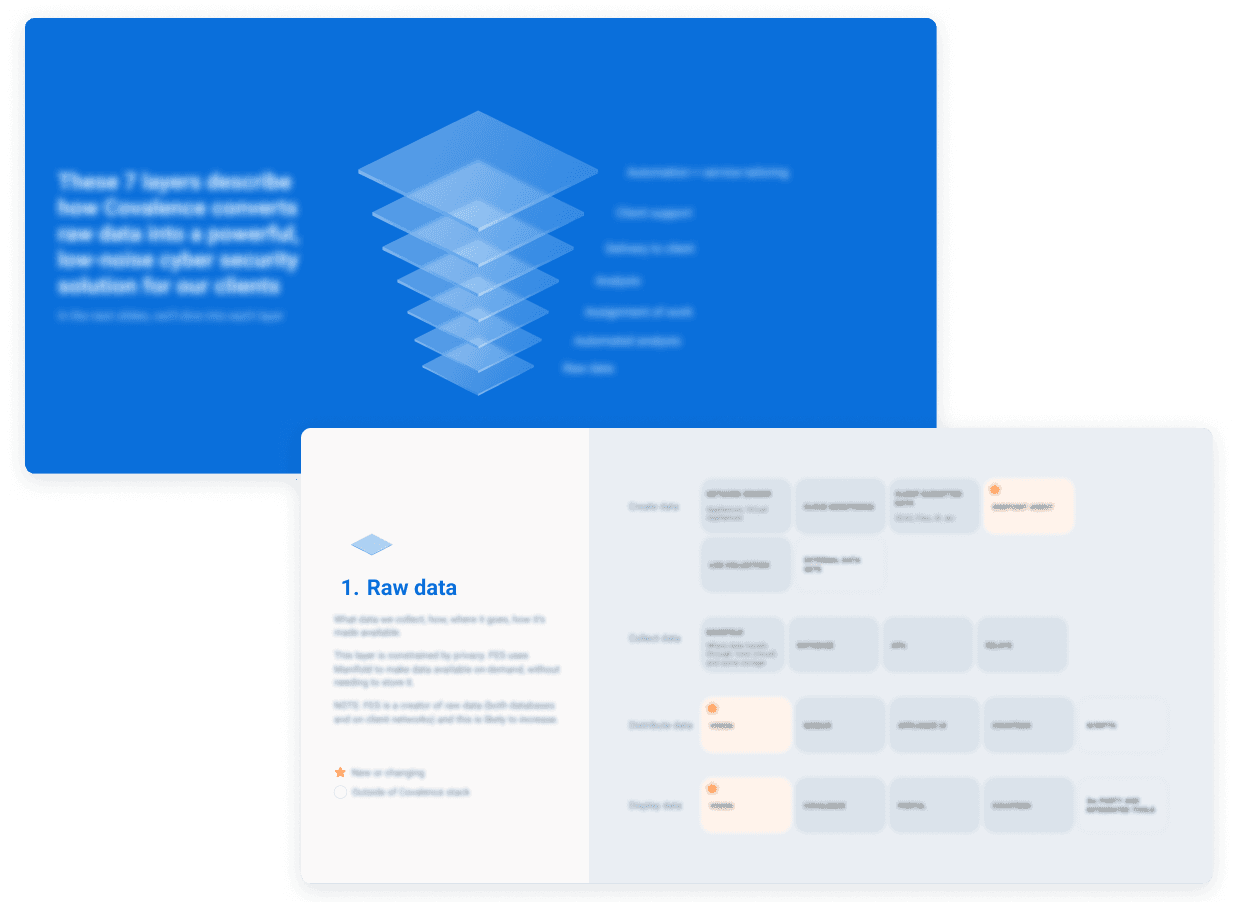
Early in discovery, it became clear that there were different perspectives on the way the service truly worked. To remedy this, I compiled notes on the various types of data, phases, tools, and services, and created a model that shows how raw data led to the desired outcome of a mitigated risk. This model gave us a shared understanding and place to point to to discuss what was really happening, bridging the gap between service operators and leaders.
Ecosystem Map (blurred for security)
Covalence is complicated. I created a layered model to give us something to point to and discuss, such as the lowest Raw Data level which explores all the inputs that go into the service. This layered approach - and having a physical map to point to - helped analysts explain to leaders that they were already getting the data they needed from their own tools, and that they simply didn't need Covalence in their toolkit.
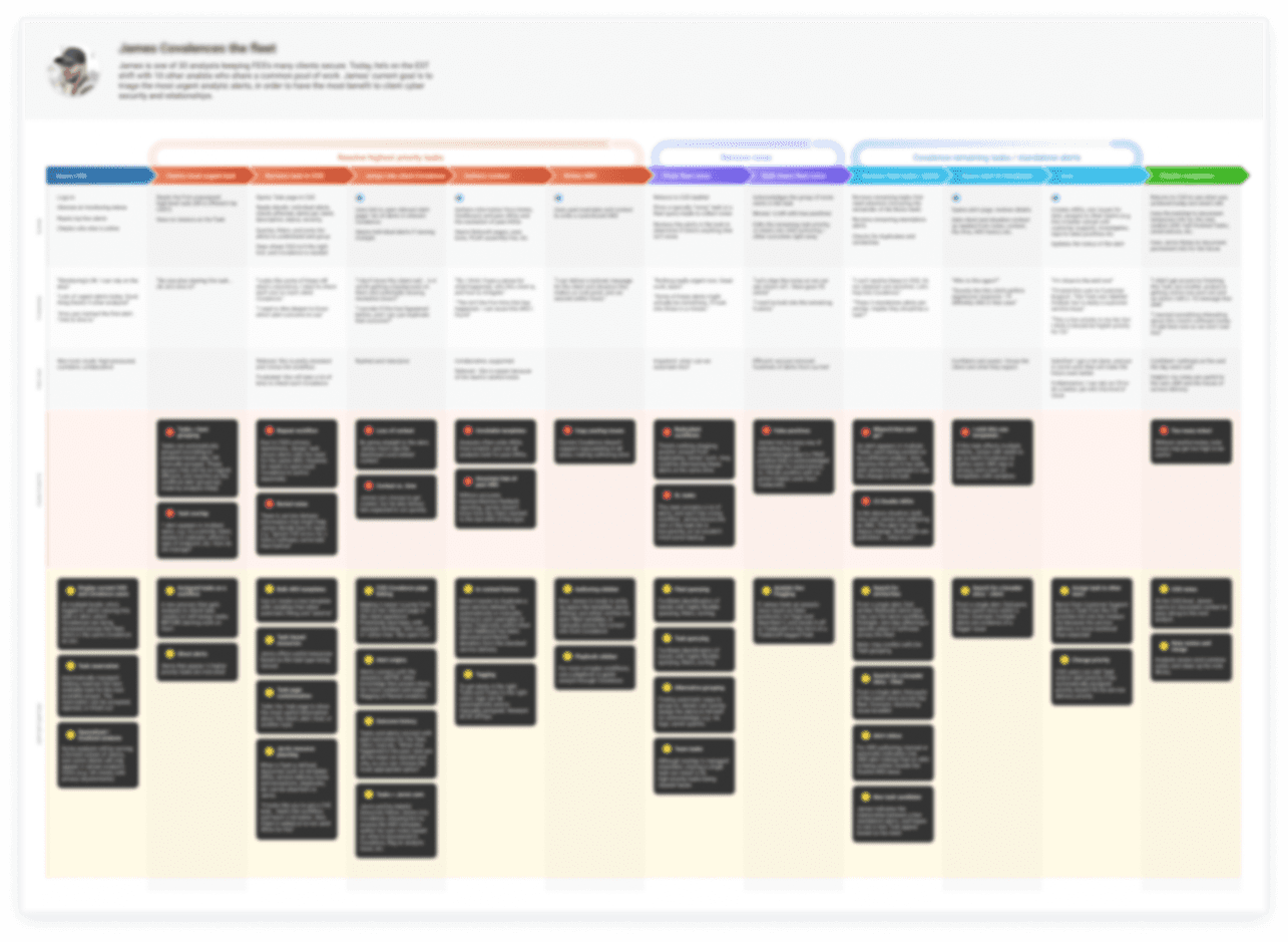
User journey maps (blurred for security)
These journey maps highlighted just how rarely analysts and clients used Covalence, and how switching tools was seen as an unnecessary barrier to their goal.
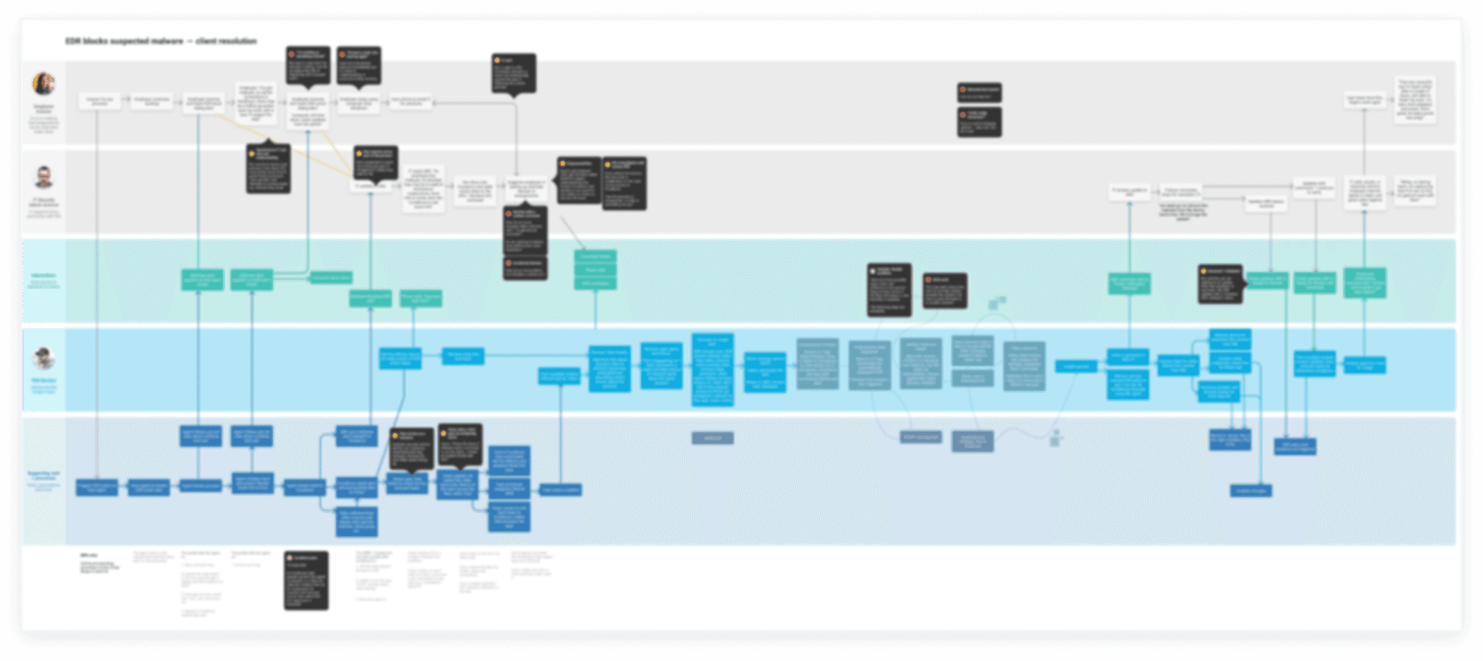
Service Blueprints
This blueprint showed how a suspicious activity is picked up by Covalence, how analysts respond, and how clients mitigate the threat. This highlighted what client users are doing instead of using Covalence, such as using the "request help" feature to ask an analyst to list which laptops need an update.
So, if we can solve the data access issue, does anyone actually need Covalence?
After building a shared understanding with leadership, I re-aligned our goals. We decided that bringing the data to the Portal made the most sense, and this work began immediately.
So, what was left? Aside from modernizing the product to make it future-proof, the original reasons for the redesign had vanished.
Luckily, it was my new persona, Ron, who helped us discover a vital new reason. Ron is a skeptic. He has worked as a cyber security analyst in the past, and thinks Field Effect is too good to be true. Luckily Field Effect really is that good, and sales informed me that prospective clients trust the service after seeing behind the curtain.
So, we decided to pivot; Covalence would be that glimpse behind the curtain that shows exactly why Field Effect can deliver on its claims. Covalence would become a storyteller, not a detective.
With this new goal, the project proceeded as planned. To be a good storyteller, Covalence had to be fully functional and able to support our sales team in "showing, not telling" when Ron asked a tough technical question!
Solution deep dive: de-siloing data to support a threat hunting story
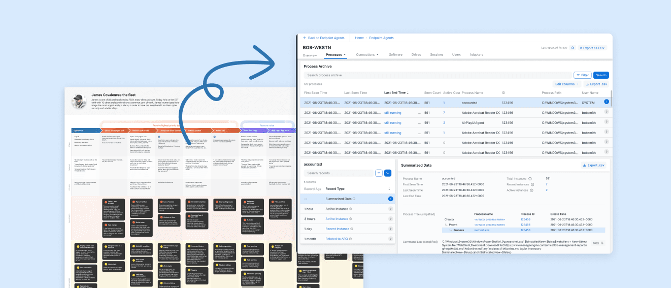
One of the biggest challenges we encountered was the range of data storage types. Covalence collects a huge amount of live data, stored it for a certain amount of time, and then converted this data into summaries.
When a cyber security alert is triggered - such as a device logging in from an unexpected location - cyber security analysts investigate to see if it's malicious or merely unusual. They spot clues in the raw data to understand what happened, how this compares to historic data, if it looks like an attack, and if this is reasonable for the user and company context. Analysts needed to be able to follow clues quickly and intuitively, jumping from historic data to live data to device or user data to build a complete picture. In the previous UI this data was siloed, several clicks apart, and relied on analysts re-querying to find the data they were interested in.
Working with the analyst team, I built a view that clearly displayed everything the sensor knew and allowed analysts to follow that data with a single click. This involved building and testing new types of layout that combined summarized data, recent logs, and even live data (this is gold for analysts as it allows them to stop or mitigate an attack.) Testing proved that a combined list of "records" worked well, helping analysts (and Ron!) know that they were seeing everything Covalence knew about a certain user, software, network etc.
The outcomes
The outcome I'm most proud of is that the data clients need is now presented right where clients need it - in the Portal - rather than in a raw data tool. Reducing the friction between getting and alert and mitigating a risk is critical, and I believe that my advocacy for breaking down product siloes and using the entire platform to solve unmet needs led us here. This reduced friction is apparent in Field Effect's position as the industry leader for Managed Detection and Response for 4 years running, with an exceptional 98/100 net emotional footprint, 99/100 service experience, 98 product experience by InfoTech's Software Reviews. Trust and reliability are also listed as top "pros" based on client reviews, and this trust is established when prospects and clients can ask Field Effect to show, not tell, by offering a peek behind the curtain in Covalence.
To see an early version of this UI in its role as a demo tool (plus many other features I designed and collaborated on across other products) take a peek at a recorded live demo. Here, you can see how our sales engineer, Ted, uses the UI to showcase how our analysts work. You can also hear Ted reassure the audience that this UI is not something they'll need to use "you don't have to live [in] that interface, you understand."
And that's the big win - by conducing research, establishing a shared understanding, and strategizing with the entire platform rather than siloes products, we were confident we understood what Covalence would and would not be used for… and we were right!