Cyber Security Mini Case Studies
Research
UX Design
Service Design
Visual Design
Project Management
2021-2023
These short case studies showcase my work as a UX designer, service designer, project manager, and teammate at a growing cyber security company. Due to the sensitive nature of these projects, these are brief summaries of my approach and images are blurred.
Cyber Security Mini Case Studies
Research
UX Desgin
Service Design
Visual Design
Project Management
2021-2023
These short case studies showcase my work as a UX designer, service designer, project manager, and teammate at a growing cyber security company. Due to the sensitive nature of these projects, these are brief summaries of my approach and images are blurred.
Case Study 1: Transforming stakeholder vibes from low-trust to high-confidence
A new report with the goal of delivering summarized data and insights about the service and tickets to our clients was lagging behind schedule. The project was handed to me to bring over the finish line. Sensing dissatisfaction within the team and stakeholders, I created a small working group from across the company: sales, client success, development, and IT security. These meetings gave stakeholders space to discuss their doubts that the report would be helpful to users, and their feeling that the resource investment in the project had been too high. To verify whether the report would truly hold no value for users, I conducted usability tests with our internal IT team. My focus was to learn how they interpreted the report, how they saw it fitting into their work rituals, any unmet reporting needs, and how ready the report was for release to clients. These tests revealed an already-high level of usefulness, but also several critical bugs and areas of misinterpretation. Bringing these findings back to my stakeholder working group, there was an immediate boost in morale. We prioritized fixes, and our higher level of confidence allowed us to see the value in delaying release in order to implement them. I also worked with our internal cyber security analyst team to verify that the insights and data were accurate and useful, catching several more bugs. With a report we felt confident in, we then scaled up to pilot test with friendly clients and partners. I created a survey to collect feedback, and we repeated our prioritization and fix cycle again. An interesting finding was that the report would be used by different users than expected, and the name conflicted with existing, rarely-used reports. By retargeting several reports and our product's reports page, we ensured the intent and audience for each report was clear. With strong approval ratings and evidence of usefulness, the report shipped and became one of the most used report types, and an unexpected resource for our sales team.
Outcomes
A re-worked summary report that we knew would be used as a monthly IT team meeting resource or to present IT security to higher levels of organizations
A re-worked summary report that we knew would be used as a monthly IT team meeting resource or to present IT security to higher levels of organizations
A re-worked summary report that we knew would be used as a monthly IT team meeting resource or to present IT security to higher levels of organizations
Reports were highly desireable across many usecases. They were requested by our sales team and leaders as a clear way to show prospective clients what life with the service looked like
Reports were highly desireable across many usecases. They were requested by our sales team and leaders as a clear way to show prospective clients what life with the service looked like
Reports were highly desireable across many usecases. They were requested by our sales team and leaders as a clear way to show prospective clients what life with the service looked like
A major shift in team and stakeholder confidence and trust
A major shift in team and stakeholder confidence and trust
A major shift in team and stakeholder confidence and trust
Changes to other reports and report pages to align with user expectations
Changes to other reports and report pages to align with user expectations
Changes to other reports and report pages to align with user expectations
Improved understanding of how clients wished to interact with data of all types
Improved understanding of how clients wished to interact with data of all types
Improved understanding of how clients wished to interact with data of all types
Case Study 2: Solving a complex integration problem with user empathy and co-design
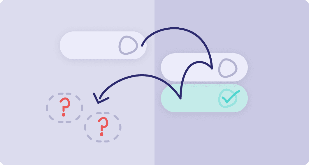
IT service providers use many services to stay on top of client organizations' IT needs, and they expect to gather these services' outputs into a single ticketing tool. What began as a project to create a new integration based off existing patterns led me to solve a complex technical and communications problem, and identify opportunities to improve our service for all users. By working with closely with an IT service design partner, developers, and the analyst team, I built an understanding of the integration's technical requirements and the pain points leading partners to contact our customer success team. I also interviewed our partner and followed them through how they used their ticketing system, and reviewed demos by other organizations to ensure we weren't overly focused on a single type of setup. This revealed several unforeseen technical and behavioural issues impacting existing integrations and our own product and service. Most critically, we saw that clients frequently misunderstood our ticket statuses and chose the wrong option even within our own product. An incorrect status could tell our service to change future alerts - not good news - and we relied on our service delivery team to spot and correct these statuses. This was exacerbated in integrations, since users were less likely to understand the complexities of our service, and where an incorrect integration setup would cause issues for every ticket. I addressed this challenge by ensuring technical discovery was a priority from the beginning, setting up a team of a developer, members of the partner organization, and myself to co-create a solution. With a better understanding of the technical mapping between products, I worked on a UX flow that gave the admin setting up the integration guiderails and the knowledge to bridge the gap between services. The result was an integration that was far more likely to result in usable tickets for partners and clean feedback for our service. To verify the integration wizard achieved our goals, we asked our partner to set it up during a usability test. However, they were so excited for the improved workflow that they set it up ahead of schedule. Their happy email said it all - it was easy to use and did what they needed. Over the next months, more partners set up this integration, and new feedback identified ways to better fit our tickets into broader goals like categorizing and reporting. We worked with multiple partners to optmize the integration, improving how our tickets fit into their tool and setting a new standard for future integrations.
Outcomes
An integration capable of fitting into a wide variety of workflows and ticketing system setups, making our tickets easy for IT System Admins to use
An integration capable of fitting into a wide variety of workflows and ticketing system setups, making our tickets easy for IT System Admins to use
An integration capable of fitting into a wide variety of workflows and ticketing system setups, making our tickets easy for IT System Admins to use
An integration wizard that resolved the unintended impact on service settings, communicated complex steps, and was proven simple enough to be set up without support
An integration wizard that resolved the unintended impact on service settings, communicated complex steps, and was proven simple enough to be set up without support
An integration wizard that resolved the unintended impact on service settings, communicated complex steps, and was proven simple enough to be set up without support
As our first partner co-designed project, this project lead to more support for partner relationships, both from within our company and from partners themselves.
As our first partner co-designed project, this project lead to more support for partner relationships, both from within our company and from partners themselves.
As our first partner co-designed project, this project lead to more support for partner relationships, both from within our company and from partners themselves.
Identification of ticket resolution pain points across all products and integrations. Over time, this and other projects led to the UX exploring new bluesky concepts, which then fed into platform and product roadmaps and even a new self-serve product.
Identification of ticket resolution pain points across all products and integrations. Over time, this and other projects led to the UX exploring new bluesky concepts, which then fed into platform and product roadmaps and even a new self-serve product.
Identification of ticket resolution pain points across all products and integrations. Over time, this and other projects led to the UX exploring new bluesky concepts, which then fed into platform and product roadmaps and even a new self-serve product.
Case Study 3: Creating a vision for an industry-leading cyber range client tool
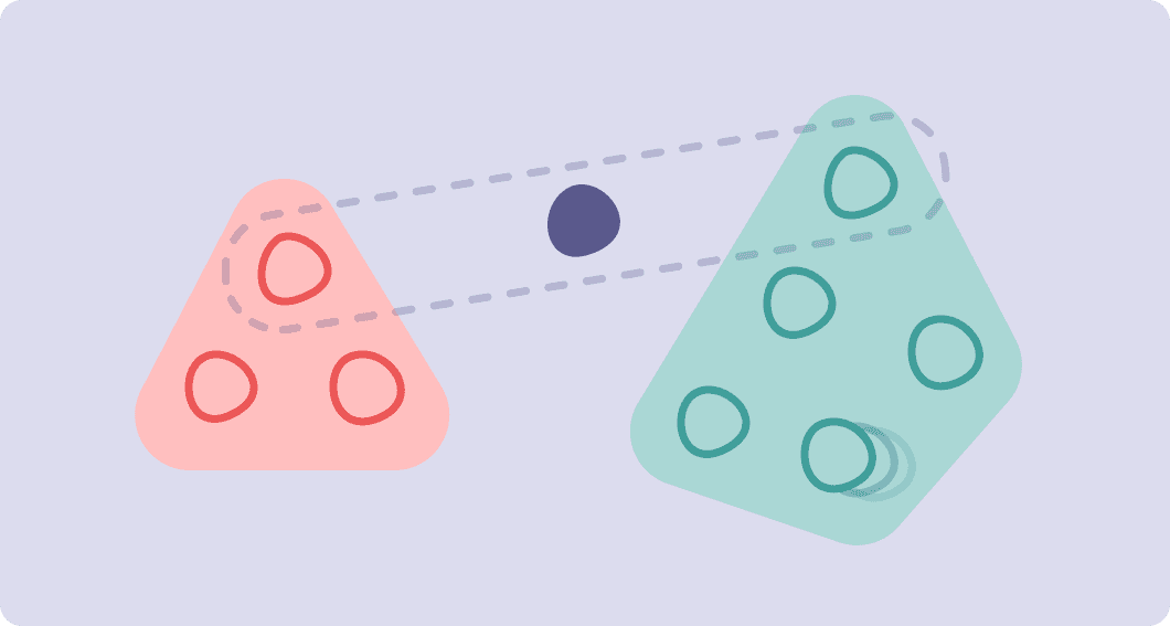
Cyber ranges are virtual networks for educational and recreational security and IT training, and can emulate cyber attacks in real time. Our cyber range product was failing to attract client users due to its steep learning curve, patchwork of disparate products, and reliance on the support team. It was also extremely resource-intensive to create our own materials and to meet the needs of clients and prospects. With a big dream to scale the service, we knew we needed to completely overhaul the entire system. My role included strategy, stakeholder engagement, project management, research, UX/UI design, and design systems. I shared this work with another UX designer. With the team being new to this scope of project, I aligned stakeholders on a clear and achievable proof of concept within a tight deadline, a vision of the future to strive for, and a roadmap to take us through these steps. I also helped the team adapt to regular priority changes. By co-creating with existing users, we identified pain points, requirements, user flows, wireframes, and early designs that our internal users were extremely supportive of. Unfortunately, this project was cut due to factors beyond the team. Despite this, it remains one of my favourite projects and teams. I'm proud to have helped navigate the team from uncertainty towards a clear, exciting future, and I believe the end result would have become an industry leader.
Outcomes
An optimistic-realistic team during a time of immense uncertainty and change
An optimistic-realistic team during a time of immense uncertainty and change
An optimistic-realistic team during a time of immense uncertainty and change
A shift to user-first product development with full leadership support
A shift to user-first product development with full leadership support
A shift to user-first product development with full leadership support
Clear requirements and product roadmap to meet a tight initial deadline and long-term scale goals
Clear requirements and product roadmap to meet a tight initial deadline and long-term scale goals
Clear requirements and product roadmap to meet a tight initial deadline and long-term scale goals
User flows, wireframes, prototypes, and early designs for client-friendly course authoring, network creation, participant experience, and facilitator experience, solving major pain points and reducing the learning curve for future client users.
User flows, wireframes, prototypes, and early designs for client-friendly course authoring, network creation, participant experience, and facilitator experience, solving major pain points and reducing the learning curve for future client users.
User flows, wireframes, prototypes, and early designs for client-friendly course authoring, network creation, participant experience, and facilitator experience, solving major pain points and reducing the learning curve for future client users.
Case Study 4: Using service design to prevent a scale-up nightmare
"Intern, Need you to send me 100 $100 e-gift cards asap. Forgot to do this earlier. - CEO." Our email plugin offered employees at client organizations a second opinion on suspicious emails like this. However, usage was low, and results relied on the client IT team contacting the employee. I was tasked with designing an email to deliver results to the submitter. By seeking to understand how the results could create safer email use, my work lead us to a critical year-long service repair and a feedback system that lead to safer email use. I began by seeking to understand how the results would be interpreted by employees. Working with our service delivery team, client success, and comments from users, I discovered that the highly technical results were not suitable for our target audience, failed to align with best practices our analyst team would recommend, and was unlikely to actually unblock users. I identified a behavioural outcome: giving the intern the confidence to ask the CEO if they really needed 100 $100 gift cards, using a different communications channel. I then explored email service and design concepts that could achieve this behaviour. This included new visual designs and copy strategy, as this was one of very few direct touchpoints this user had with our company. We also discovered that the service itself had several critical bugs and pain points leading to missing, delayed, or inaccurate results. Analysts needed to step in to resolve some issues, and users were submitting for reasons we didn't expect. I captured these findings in a service flow diagram and summarized, which helped us pinpoint and prioritize what needed to change. With a concrete list of recommendations and the evidence to support it, I approached leadership with the recommendation that we delay the new emails until we fix the underlying service. This recommendation was taken, and a backend development team used my report to explore solutions. After a year of work, the service was repaired and the email project was restarted by another designer, as I had moved teams. This designer consulted with me and referred to my early design concepts to create a behaviour-focused feedback system. We created a solution that was transparent about the revised service's abilities, elegantly dealt with unpredictable wait times, and focused on supplying the confidence boost and best practices needed for an intern to question their CEO about a sketchy email.
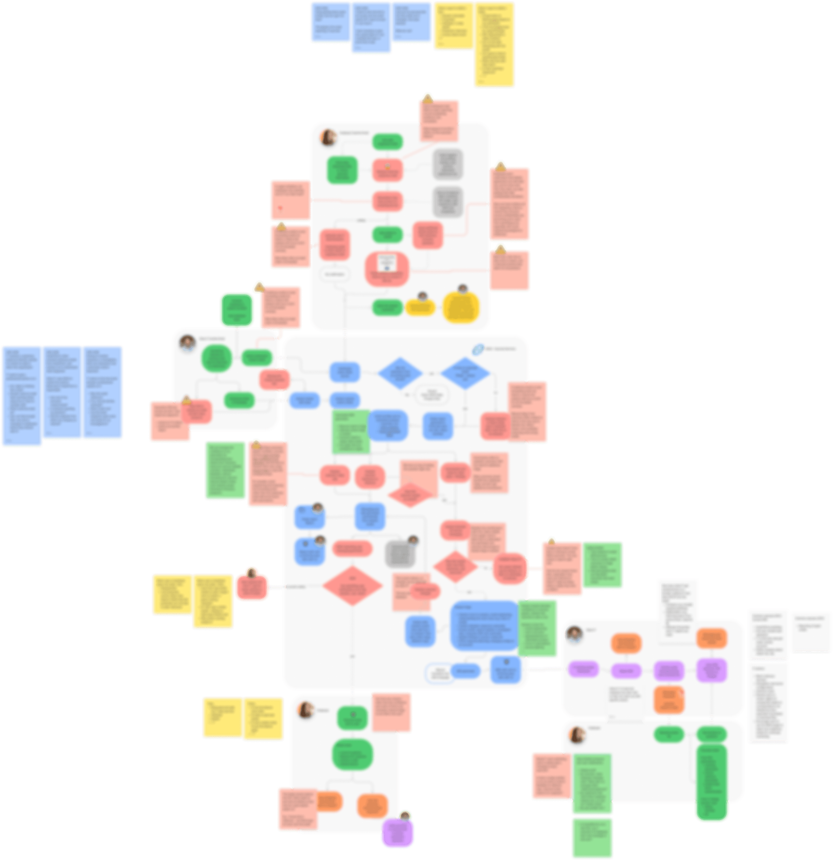
A blurred preview of the flow diagram I co-created with developers and cyber secuirty analysts. This begins with an employee feeling like an email is suspicious and explores all the paths, outcomes, users, and processes that could occur. Laying the service out allowed us to spot pain points and bugs more easily (show in red. Lots of red.)
Case Study 4: Using service design to prevent a scale-up nightmare
"Intern, Need you to send me 100 $100 e-gift cards asap. Forgot to do this earlier. - CEO." Our email plugin offered employees at client organizations a second opinion on suspicious emails like this. However, usage was low, and results relied on the client IT team contacting the employee. I was tasked with designing an email to deliver results to the submitter. By seeking to understand how the results could create safer email use, my work lead us to a critical year-long service repair and a feedback system that lead to safer email use. I began by seeking to understand how the results would be interpreted by employees. Working with our service delivery team, client success, and comments from users, I discovered that the highly technical results were not suitable for our target audience, failed to align with best practices our analyst team would recommend, and was unlikely to actually unblock users. I identified a behavioural outcome: giving the intern the confidence to ask the CEO if they really needed 100 $100 gift cards, using a different communications channel. I then explored email service and design concepts that could achieve this behaviour. This included new visual designs and copy strategy, as this was one of very few direct touchpoints this user had with our company. We also discovered that the service itself had several critical bugs and pain points leading to missing, delayed, or inaccurate results. Analysts needed to step in to resolve some issues, and users were submitting for reasons we didn't expect. I captured these findings in a service flow diagram and summarized, which helped us pinpoint and prioritize what needed to change. With a concrete list of recommendations and the evidence to support it, I approached leadership with the recommendation that we delay the new emails until we fix the underlying service. This recommendation was taken, and a backend development team used my report to explore solutions. After a year of work, the service was repaired and the email project was restarted by another designer, as I had moved teams. This designer consulted with me and referred to my early design concepts to create a behaviour-focused feedback system. We created a solution that was transparent about the revised service's abilities, elegantly dealt with unpredictable wait times, and focused on supplying the confidence boost and best practices needed for an intern to question their CEO about a sketchy email.

A blurred preview of the flow diagram I co-created with developers and cyber secuirty analysts. This begins with an employee feeling like an email is suspicious and explores all the paths, outcomes, users, and processes that could occur. Laying the service out allowed us to spot pain points and bugs more easily (show in red. Lots of red.)
Case Study 4: Using service design to prevent a scale-up nightmare
"Intern, Need you to send me 100 $100 e-gift cards asap. Forgot to do this earlier. - CEO." Our email plugin offered employees at client organizations a second opinion on suspicious emails like this. However, usage was low, and results relied on the client IT team contacting the employee. I was tasked with designing an email to deliver results to the submitter. By seeking to understand how the results could create safer email use, my work lead us to a critical year-long service repair and a feedback system that lead to safer email use. I began by seeking to understand how the results would be interpreted by employees. Working with our service delivery team, client success, and comments from users, I discovered that the highly technical results were not suitable for our target audience, failed to align with best practices our analyst team would recommend, and was unlikely to actually unblock users. I identified a behavioural outcome: giving the intern the confidence to ask the CEO if they really needed 100 $100 gift cards, using a different communications channel. I then explored email service and design concepts that could achieve this behaviour. This included new visual designs and copy strategy, as this was one of very few direct touchpoints this user had with our company. We also discovered that the service itself had several critical bugs and pain points leading to missing, delayed, or inaccurate results. Analysts needed to step in to resolve some issues, and users were submitting for reasons we didn't expect. I captured these findings in a service flow diagram and summarized, which helped us pinpoint and prioritize what needed to change. With a concrete list of recommendations and the evidence to support it, I approached leadership with the recommendation that we delay the new emails until we fix the underlying service. This recommendation was taken, and a backend development team used my report to explore solutions. After a year of work, the service was repaired and the email project was restarted by another designer, as I had moved teams. This designer consulted with me and referred to my early design concepts to create a behaviour-focused feedback system. We created a solution that was transparent about the revised service's abilities, elegantly dealt with unpredictable wait times, and focused on supplying the confidence boost and best practices needed for an intern to question their CEO about a sketchy email.

A blurred preview of the flow diagram I co-created with developers and cyber secuirty analysts. This begins with an employee feeling like an email is suspicious and explores all the paths, outcomes, users, and processes that could occur. Laying the service out allowed us to spot pain points and bugs more easily (show in red. Lots of red.)
A demonstration of SEAS at 29:40, one of sales engineer Ted Raymond's favourite features. Ted also does a great job raising some concerns about the service and helping MSPs and companies overcome them.
Outcomes
Identification and advocacy for service fixes and improvements resulted in an accurate, useful, ready-for-scale solution
Identification and advocacy for service fixes and improvements resulted in an accurate, useful, ready-for-scale solution
Identification and advocacy for service fixes and improvements resulted in an accurate, useful, ready-for-scale solution
A feedback system and series of emails that raises the odds of an employee being unblocked when dealing with a suspicious email, and trains them to become a safer email user
A feedback system and series of emails that raises the odds of an employee being unblocked when dealing with a suspicious email, and trains them to become a safer email user
A feedback system and series of emails that raises the odds of an employee being unblocked when dealing with a suspicious email, and trains them to become a safer email user
Email feedback adjusted to better align with our service delivery strategy
Email feedback adjusted to better align with our service delivery strategy
Email feedback adjusted to better align with our service delivery strategy
Less resource-intensive: manual steps for service delivery team and client IT teams removed
Less resource-intensive: manual steps for service delivery team and client IT teams removed
Less resource-intensive: manual steps for service delivery team and client IT teams removed
Improved feedback loop completion to 100%, and managed employees' expectations during longer analysis times by sending a pending email
Improved feedback loop completion to 100%, and managed employees' expectations during longer analysis times by sending a pending email
Improved feedback loop completion to 100%, and managed employees' expectations during longer analysis times by sending a pending email
Get in touch
©2024 Beccy Murphy. All rights reserved. Website built in Framer.
Get in touch
©2024 Beccy Murphy. All rights reserved. Website built in Framer.
Get in touch
©2024 Beccy Murphy. All rights reserved. Website built in Framer.